Your first 10 minutes in Ignyte IQ
This article walks through a four-step routine on the Brand Overview dashboard: set a date range, add a comparison, check data freshness, and drill into a metric.
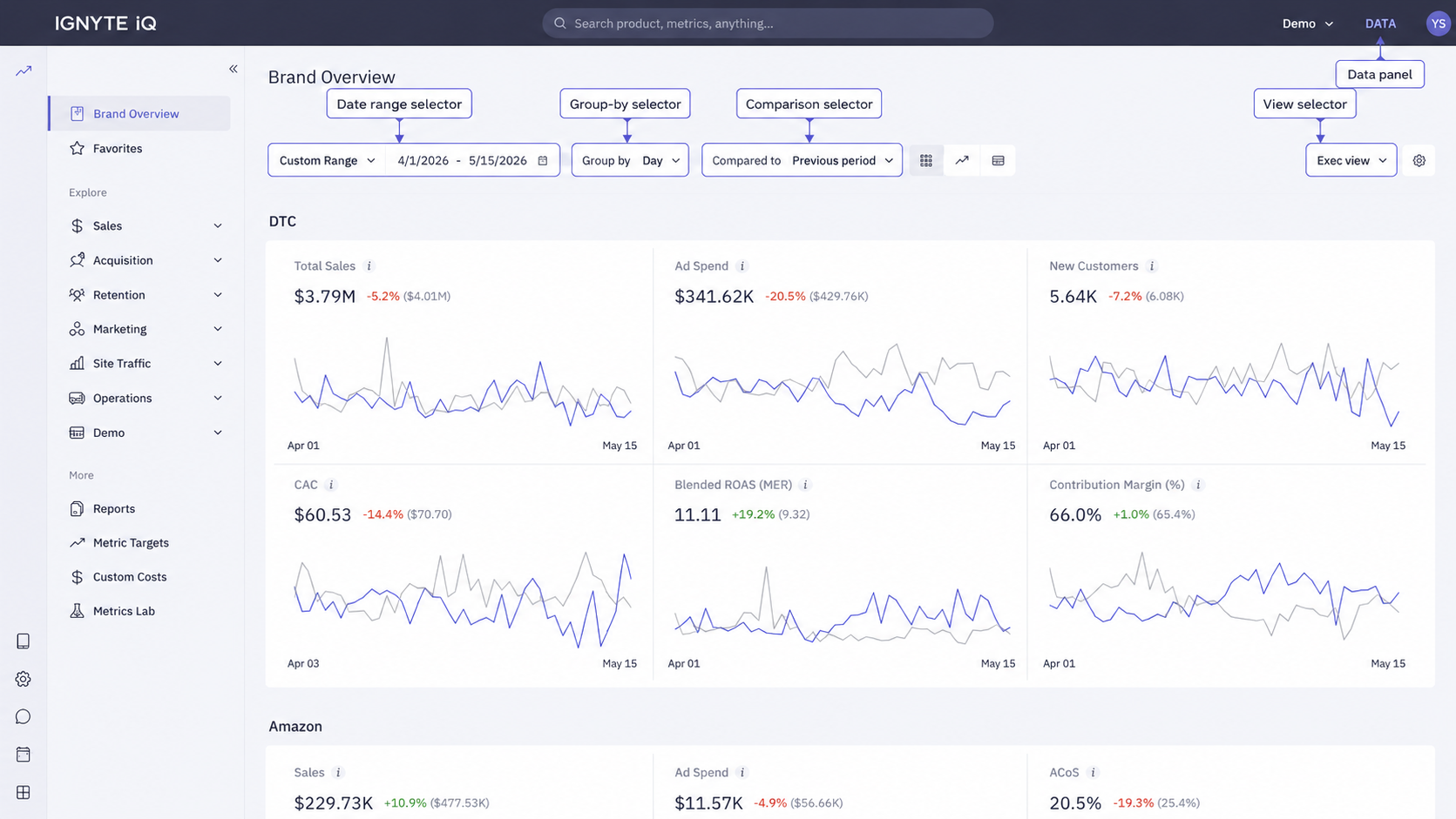
The routine uses controls that appear on every dashboard in Ignyte IQ. Once familiar with these four steps, the same workflow applies in Explore and Reports.
The four steps
Section titled “The four steps”-
Set the date range. On Brand Overview’s control bar, click the date-range selector and choose Yesterday. The dashboard recalculates to show one full day of data.
-
Add a comparison. Next to the date range, click the comparison selector and choose Previous Period. Each metric tile now displays a percentage change and a directional arrow vs the day before.
-
Check data freshness. Click the Data panel button in the top-right. Each connected datasource is listed with its connection status and last-sync time. A datasource showing Connected with a recent timestamp is current.
For per-metric freshness, close the Data panel and click the ℹ️ icon on any tile. The ℹ️ panel shows the datasource powering that metric and when the metric was last calculated.
-
Drill into a metric. Click a metric tile body (not the ℹ️ icon). The breakdown view shows what contributed to the value — top products, top channels, top campaigns, depending on the metric.
Save the configuration
Section titled “Save the configuration”A specific combination of date range, comparison, and filters can be saved as a View for one-click reuse. View selectors are part of the control bar on every dashboard.
See Creating and using saved Views.
Other date-range and comparison options
Section titled “Other date-range and comparison options”| Date range | Comparison |
|---|---|
| Yesterday | Previous Period (day-over-day) |
| Last 7 days | Previous Period (week-over-week) |
| Last 30 days | Previous Period (period-over-period) |
| Month to date | Same Period Last Year |
| Custom | Same Period Last Year |
Same Period Last Year is useful for businesses with strong seasonality. Previous Period is the most common choice for day-over-day operational reporting.
Common questions
Section titled “Common questions”Why don’t numbers exactly match Shopify or an ad platform?
Differences typically fall into one of four categories: timing, definition, scope, or attribution. See Why numbers don’t match.
How often should the dashboard be checked?
Sync intervals are typically hourly per source. Two checks per day — morning after overnight syncs complete, and optionally mid-day during active campaigns — covers most operational reporting.
A metric is missing from Brand Overview.
The datasource that powers it isn’t connected in the current workspace, or the metric lives on a different tab. Open the Data panel to see what’s connected.
Troubleshooting
Section titled “Troubleshooting”- Dashboards show no data — datasources may still be running their initial sync. Check the Data panel for sync status.
- Numbers don’t match a source platform — open the ℹ️ panel on the metric and confirm definition and date anchor. See Why numbers don’t match.
- A comparison percentage looks wrong — confirm the date range and comparison period are both complete; comparing partial periods can produce misleading deltas.