Reading an Explore dashboard
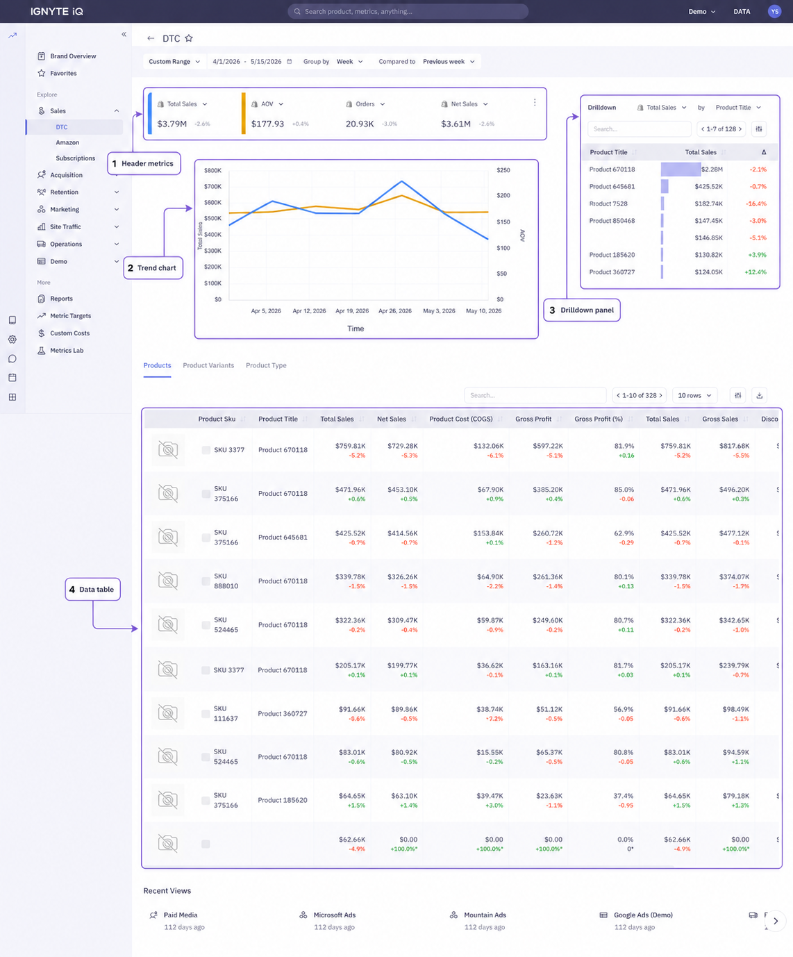
Every dashboard in the Explore section shares the same four-part layout: a row of header metrics, a trend chart, a drilldown panel, and a data table. The metrics and breakdowns vary by dashboard; the structure is consistent.
The same layout pattern is used across Sales, Acquisition, Retention, Marketing, Site Traffic, and Operations dashboards.
The four parts
Section titled “The four parts”Header metrics
Section titled “Header metrics”A row of tiles at the top showing headline values for the selected date range. Each dashboard’s header metrics are tuned to that functional area (Sales emphasizes revenue and AOV; Paid Media emphasizes spend and ROAS).
See Reading metric tiles for the per-tile components.
Trend chart
Section titled “Trend chart”A larger time-series chart below the headers. Plots one or more header metrics over the selected date range at the current Group By granularity.
Drilldown panel
Section titled “Drilldown panel”Typically on the right side of the dashboard. Ranks contributors (products, campaigns, channels, platforms) by a selected metric. The ranking dimension and metric are changeable via a dropdown at the top of the panel.
See Drilldown panels.
Data table
Section titled “Data table”Below the rest of the dashboard. The full sortable, filterable, exportable view. Where supported, tabs above the table switch between breakdown levels (Products vs Variants, Parent ASIN vs Child ASIN).
See Using data table features.
The control bar
Section titled “The control bar”The top of every Explore dashboard has the same four controls:
| Control | Effect |
|---|---|
| Date Range | Sets the period every tile reads from |
| Group By | Sets the granularity of the trend chart (daily, weekly, monthly) |
| Compared To | Sets the comparison period (Previous Period, Same Period Last Year) |
| Views | Save or load a complete page configuration |
Changing any control recalculates the entire dashboard.
For details, see Using the control bar.
A typical workflow
Section titled “A typical workflow”- Click into the Explore dashboard from the corresponding Brand Overview section or tile.
- Confirm the change in the header metric.
- Use the trend chart to identify when the change started.
- Use the drilldown panel to rank contributors and identify what’s driving the change.
- Use the data table for exact values or to export.
Common questions
Section titled “Common questions”The Explore dashboard’s totals differ from Brand Overview.
The two surfaces have independent control bars. Confirm the date range, comparison, and filters match.
A filter applies to the table but not the headers.
Most filters affect the entire dashboard. If a filter affects only the table, it’s typically a table-specific control (sort, search) rather than a dashboard filter.
The drilldown shows different top items than the table.
The drilldown is sorted by the panel’s selected metric; the table is sorted by whichever column was last clicked. Match the sorts to compare directly.